
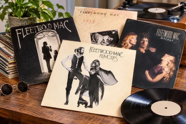
Fleetwood Mac album covers tell a parallel story to the music itself, from mystical 1970s imagery and onstage romance to bold 1980s pop confidence and stripped-back reunion photos. Each sleeve reflects the band’s changing lineup, personal drama, and evolving sound.
Why Fleetwood Mac Album Covers Still Fascinate Us
When we talk about Fleetwood Mac, most people think of the songs first. Yet for many fans, the visual memories come just as fast. The Rumours couple frozen mid-dance, the white room of Fleetwood Mac, the dreamy collage on Tusk, the smoky Close-up of Stevie Nicks on Bella Donna. These images live in our heads together with the music, and they shape the way we feel about the band.
The story behind iconic Fleetwood Mac album covers is not just about design trends or record-label ideas. It is about relationships inside the band, changing fashion, photography styles, and the way rock stars wanted to show themselves to the world. Fleetwood Mac album covers became a visual diary of chaos, heartbreak, recovery, and reinvention.
In this guide, we walk through the most important eras of Fleetwood Mac album covers, from the blues-rock years in the late 1960s to the superstar period with Stevie Nicks and Lindsey Buckingham, then into the MTV age and the later reunions. Along the way, we connect the stories behind the photos, the symbolism in the layouts, and how all of it links back to the songs.
From London Blues Band To Visual Identity: The Early Years
Fleetwood Mac started in 1967 as a British blues band led by Peter Green. The early albums used simple, sometimes rough artwork that matched the raw sound. These were not yet the dreamy, polished Fleetwood Mac album covers people know today, but they planted the first seeds of the band’s visual identity.
The self-titled 1968 UK debut: A literal introduction
The first UK album, also named “Fleetwood Mac,” has an almost homemade feel. The band stands in a loose group, young and serious, with no dramatic styling. The cover is direct: here are the musicians, no mystery, no heavy concept. At that time, they were just trying to be noticed in the crowded London blues scene. The roughness fits the raw guitar tone and live energy inside.
Mr. Wonderful and Then Play On: Moving from blues to mood
“Mr. Wonderful” kept the simple look, with a slightly playful twist, but “Then Play On” marked an artistic step up. The cover used a classical painting, dark and moody, which hinted that the music had grown deeper and more experimental. You can feel the shift from pure blues into something more psychedelic and emotional. Even before the famous lineup changes, Fleetwood Mac album covers began to reach for something more symbolic.
Building The Classic Image: Christine McVie and the American shift
By the early 1970s, Christine McVie joined the group and became a key songwriter and singer. She also brought a calm, grounded presence that subtly changed how the band looked and felt. The music started moving away from strict blues into softer rock, folk touches, and piano-driven songs. The covers from this period reflect a band in transition.
Future Games and Bare Trees: Dreamy, distant landscapes
“Future Games” and “Bare Trees” both use distant, almost lonely imagery. “Future Games” leans into hazy, surreal mood, while “Bare Trees” shows stark nature and fog. On these Fleetwood Mac album covers, the band members do not appear front and center. Instead, we see places and atmospheres. It feels like the group was searching for a new identity, letting the listener project emotions onto the scenery instead of staring at band faces.
The music inside is gentle, sometimes melancholic, with strong songwriting from Christine McVie and guitarist Danny Kirwan. The visuals match that introspective, drifting feel: you are walking through a dream instead of watching a rock star close-up.
The Game-Changer: The 1975 Fleetwood Mac Album Cover
Everything changed when Stevie Nicks and Lindsey Buckingham joined the band and moved its center of gravity to California. The 1975 album, also called “Fleetwood Mac,” is often known as the “White Album” because of its pale background. This is one of the most important Fleetwood Mac album covers, and it set the tone for the band’s golden era.
The white room and the theater of Mick and Stevie
On the cover, drummer Mick Fleetwood stands tall in a white space, dressed in part-Edwardian, part-theatrical clothes, holding a cane. Below him, Stevie Nicks appears in a flowing black outfit, leaning into a role that would soon become legendary: the mysterious, romantic figure with her own private world. Mick balances a wooden ball between his legs, and there is another ball in his hand, a running joke he would repeat onstage.
In one image, the band sent a message: this is no longer just a blues-rock group. This is theater, character, and myth-building. The white background suggests a blank page, a fresh start. The music inside proves that idea right, bringing the hits “Rhiannon,” “Landslide,” and “Say You Love Me.” Fans often look back at this sleeve as the birth of the modern Fleetwood Mac image.
Rumours: The Most Famous Fleetwood Mac Album Cover Of All
“Rumours” is one of the best-known albums in rock history, and its cover is just as iconic. The image is simple: Mick Fleetwood and Stevie Nicks against a pale background, like a stage waiting for a play to begin. Yet this photo holds layers of meaning about love, power, and the delicate balance inside the band.
The pose that captured a storm
Stevie stands on tiptoe, one leg bent, holding out her hand. Mick, again with his wooden balls and cane, reaches toward her. The picture feels like a moment from a dance, frozen in time. At the same time, we know from the backstory that relationships in the band were collapsing: Stevie and Lindsey breaking up, Christine and John McVie divorcing, affairs and tension everywhere.
The graphic style is spare and elegant. The pale background keeps our eyes on the two figures. The typography is flowing but controlled, like a signature in the corner of a painting. Among classic rock sleeves, this is one of the Fleetwood Mac album covers that manage to carry both grace and pressure at once. Many fans read it as a portrait of two people trying to keep their balance while the floor moves underneath.
Symbolism and fan interpretations
Over the years, listeners have seen all kinds of symbols in the Rumours artwork. Some focus on Stevie’s flowing black outfit as a sign of her witchy, mystical stage persona. Others see Mick’s cane and balls as marks of stubborn humor, a man laughing in the face of chaos. Whether these meanings were planned or not, the cover fed the rumors around the band just as much as the lyrics did.
Tusk: When The Artwork Broke All The Rules
After Rumours sold millions, Fleetwood Mac could have played it safe. Instead, they took a wild turn with “Tusk.” The music is experimental and sometimes strange, and the cover matches it. Among all Fleetwood Mac album covers, Tusk may be the most surprising at first look.
The dog, the leg, and the grainy chaos
The front image shows a small, grainy black-and-white photo of a dog biting at a person’s pants leg. It looks like a random snapshot, nothing glamorous. Around it, the design uses rough textures and off-balance layout. The band lets go of the clean elegance of Rumours and dives into messy, collage-like style.
Many interpret the dog image as a metaphor for pressure or frustration nipping at the band’s heels. The group was under huge expectations after Rumours, and the Tusk cover seems to say: we are going to do this our own way, even if it looks odd. There are also several inner-sleeve images and variations depending on the release, which adds to the idea of fragmentation and too many ideas pulling in different directions.
Breaking the superstar image on purpose
Instead of putting themselves front and center, the band almost disappears from the main cover. For a group at the peak of fame, this was a bold choice. It shows a deep desire to be seen not just as polished pop stars but as restless artists. When people talk about unconventional Fleetwood Mac album covers, Tusk always comes up as the main example of creative risk.
Mirage and Tango In The Night: The 1980s Visual Glow
As the band moved into the 1980s, their music softened again into smoother pop-rock, and the visuals shifted accordingly. Mirage and Tango In The Night both carry that dreamy, polished glow that fits the era but still keeps a special personality.
Mirage: Blurred figures and soft focus
The Mirage cover shows the band members together, but they are slightly blurred and softened by light. The image feels like a memory or a dream fading at the edges. After the raw nerves of Tusk, Mirage returns to a more soothing mood. The title fits: the band seems solid, yet at the same time, you can sense that tensions remain just under the surface.
From a design point of view, this is one of the Fleetwood Mac album covers that leans heavily on atmosphere rather than sharp detail. The soft-focus style reflects early 1980s aesthetics in photography and music videos, where hazy light and slightly surreal poses were common.
Tango In The Night: Painting the sound
“Tango In The Night” uses a lush painted landscape, full of plants, reflections, and strange light. The color palette is deep green, blue, and gold, almost like a tropical evening with hints of magic. This painting fits the rich, layered sound of the album, which blends glossy 1980s production with mystical touches, especially in songs like “Big Love” and “Seven Wonders.”
This is one of the Fleetwood Mac album covers that does not show the band at all on the front, yet it feels very much like them. The scene suggests hidden stories and secret paths, just like the lyrics. It also worked well on record-store shelves, where bold color and fantasy art caught the eye quickly during the MTV age.
Behind The Mask and Time: Changing Faces, Changing Covers
As lineups shifted again around the end of the 1980s and early 1990s, the band’s visual direction also changed. “Behind The Mask” came out in 1990 with new members in the group and a different energy around the project.
Behind The Mask: Fragmented faces and identity questions
The cover for “Behind The Mask” uses a collage of faces and shapes, almost like pieces of a broken mirror. You can see different eyes and expressions, all layered together. For many fans, this summed up a band struggling with identity after Lindsey Buckingham’s departure and several new singers and guitarists stepping in.
Compared with earlier Fleetwood Mac album covers, Behind The Mask feels more modern but also less iconic. It works as a visual metaphor for mixing old and new parts, but it lacks the simple, instantly recognizable strength of Rumours or Tusk. Still, it tells an honest story of a group in transition.
Time: A quieter, more anonymous image
“Time,” released in the mid-1990s, often feels like the forgotten child in the Fleetwood Mac family. The cover design is more subdued, with muted tones and a safe, almost adult-contemporary style. The band’s lineup changed again, and the image reflects that lack of clear focus. Among Fleetwood Mac album covers, Time is not the most famous, but it shows how hard it is to build strong visual identity when the musical core keeps shifting.
The Dance and Say You Will: Revisiting The Legacy
The late 1990s brought a major reunion with “The Dance,” a live album and concert special that put the classic Rumours-era lineup back onstage together. The artwork of this period had a clear mission: connect the present to the golden memories.
The Dance: Echoes of the past
The Dance cover shows the band in warm tones, with a formal yet relaxed posture. There is no wild concept, no surreal painting, just five musicians close together again. The message is simple but powerful: we are still here, and we still belong in your life. The design nods to the elegance of earlier Fleetwood Mac album covers while updating the style for the late 1990s.
Say You Will: Stark, modern minimalism
“Say You Will,” released in the early 2000s, takes a more minimal and modern approach. The cover focuses strongly on Stevie Nicks and Lindsey Buckingham, echoing the emotional axis that has driven so much of the band’s story. The background is light and plain, similar to the 1975 Fleetwood Mac and Rumours sleeves, but the photography is sharper and more digital in feel.
This return to stripped-down visuals suits the album’s place in the band’s timeline. It is both a continuation and a reflection, aware of the past but living in a new century. Among late-period Fleetwood Mac album covers, Say You Will stands out for how clearly it frames the human core of the group.
Solo Projects That Shaped The Fleetwood Mac Visual Myth
While the main band discs form the core story, the solo releases of key members also shaped how we picture Fleetwood Mac. Stevie Nicks, Lindsey Buckingham, and Christine McVie all released solo albums that connected back to the group’s visual language.
Stevie Nicks: Bella Donna and the witchy dream
Stevie’s first solo album, “Bella Donna,” shows her in flowing clothes, holding a white bird, standing in a dark yet gentle space. Candles and soft fabric surround her. This image took the hints of mystery from earlier Fleetwood Mac album covers and pushed them into full fantasy. Over time, Bella Donna and later covers like “The Wild Heart” helped fix Stevie’s legend as a kind of rock poet with her own universe.
Lindsey Buckingham and Christine McVie: Clean lines and studio focus
Lindsey Buckingham’s solo covers tend to show him alone with guitars, studio tools, or stark backgrounds. The vibe is personal, sometimes tense, like a man wrestling with sound and ideas. Christine McVie’s solo work uses calmer, friendlier imagery, echoing her warm, steady songwriting style. All of this feeds back into how we see the full band. When listeners look over the full range of Fleetwood Mac album covers and solo projects, they see not just one group image but several overlapping personal stories.
Why These Album Covers Still Matter To Listeners
Many younger fans discover Fleetwood Mac through streaming playlists or short clips. Yet they still search out the original sleeves, buy vinyl reissues, and share scans of Fleetwood Mac album covers online. There is a reason these visuals keep pulling people in.
Each cover captures a moment in the band’s emotional weather. The white stage of Fleetwood Mac (1975) feels like a brave new start. Rumours freezes a dance of love and tension. Tusk shouts its refusal to be tamed. Tango In The Night invites us into a painted dream world. Even the less famous covers show real attempts to match image with sound, to give listeners a picture that amplifies what they hear.
For many of us, the first time we picked up a Fleetwood Mac record, the cover told us a story before the needle even touched the vinyl. The colors, the faces, the clothes, the strange details like wooden balls or white birds, all worked together to build expectations and emotions. When we listen today, whether on old records or new digital platforms, those images stay with us, making each song feel part of a larger story.
How To Explore Fleetwood Mac Album Covers In A Deeper Way
For fans who want to go further, it helps to treat the artwork like part of the band’s discography, not just packaging. A few simple habits can change the listening experience in a good way.
First, when you listen to a full album, keep the cover in view. Notice how the mood of the image matches or contrasts with certain songs. Does Rumours feel different if you stare at Mick and Stevie while “Dreams” plays? Does Tusk make more sense if you think about that dog biting at your leg during some of the stranger tracks?
Second, compare different pressings and reissues. Many Fleetwood Mac album covers have small changes across countries and years: different color tints, alternative photos on the back, new logos. These differences show how labels and designers tried to update the band’s look for new markets.
Third, look at how fan art responds to the originals. Online, people create posters, T-shirt designs, and digital collages inspired by Rumours or Tango In The Night. The fact that these images keep being remixed tells us they have real staying power. They are not just old marketing tools; they are modern cultural symbols.
Closing Thoughts: The Visual Story Behind The Sound
Fleetwood Mac album covers form a second timeline that runs right beside the music. From the plain blues-band photos of the 1960s to the white theatrical stages of the 1970s, from the messy experiment of Tusk to the glowing artwork of Tango In The Night and the stripped reunions of later years, each sleeve captures the band’s state of mind at that moment.
When we look across all these covers, we see a group constantly rewriting its own myth: sometimes polished, sometimes broken, sometimes surreal, always human. For longtime fans and new listeners alike, taking the time to notice these visual choices adds fresh layers to songs we thought we already knew. That is the lasting power of Fleetwood Mac album covers: they keep opening new doors into the same beloved music.
